

Med Spa Website Accessibility Checklist: Test the Whole Journey

In short: A med spa accessibility audit should test whether a person can understand a service, complete the next step, recover from an error and receive confirmation, not just scan the homepage. Test one complete journey, including forms, booking embeds, payment and policy steps, by keyboard, zoom, screen reader and other input modes, then assign fixes to owners. A checklist does not certify compliance, so involve an accessibility professional or legal counsel.
A med spa website accessibility audit should test whether a person can understand the service, complete the next step, recover from an error, and receive confirmation. A homepage scan is not enough. The service page, location choice, consultation form, booking embed, payment step, policy acknowledgement, and confirmation all belong to the same journey.
Use this checklist to organize testing and remediation. It does not certify compliance or replace an accessibility professional or legal counsel. The applicable legal analysis depends on facts and jurisdiction. The technical references here use current W3C guidance and U.S. Department of Justice web-accessibility guidance.
What does website accessibility mean for a med spa?
Website accessibility means designing and maintaining content and interactions so people with disabilities can perceive, understand, navigate, operate, and communicate through the site.
People may use a keyboard instead of a mouse, magnification, high contrast, captions, a screen reader, voice input, switch control, reduced motion, or other adaptations. They may also encounter temporary or situational barriers such as an injured hand, bright sunlight, low bandwidth, or a noisy room.
W3C organizes WCAG around four principles: perceivable, operable, understandable, and robust. The practical clinic question is simpler: can a person complete the same meaningful task with the information and controls available to them?
Why a med spa should audit more than the public pages
The website journey often crosses systems. A visitor may begin on a CMS page, open an embedded scheduler, move to payment, receive a third-party confirmation, and use a link in email or text to reschedule.
Each transition can introduce a barrier:
focus disappears when a dialog opens;
a location menu cannot be opened by keyboard;
an input has a placeholder but no visible label;
an error is shown only in red;
available times are announced without dates;
a timeout erases entered information;
payment fields are not clearly described;
confirmation appears visually but is not announced;
a policy link opens in an inaccessible PDF; or
the mobile layout hides the only way to continue.
Map the complete med spa booking flow, then test accessibility at every stage.
Establish scope, owners, and evidence
Before testing, create an inventory:
canonical page templates;
navigation, search, location, and provider components;
service, concern, provider, location, policy, offer, and article pages;
forms and validation;
booking, payment, chat, map, review, and media embeds;
PDFs and downloadable documents;
confirmation, reminder, cancellation, and rescheduling messages;
desktop and mobile breakpoints;
supported browsers and assistive technologies; and
content and component owners.
Record the version, date, environment, tester, device, browser, assistive technology, task, result, and evidence. A screenshot alone may not capture focus order or spoken output; use notes or short recordings where appropriate and permitted.
Test one complete journey in five modes
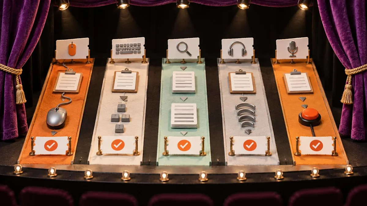
Run the same meaningful task through multiple interaction modes and record where the path breaks.
Choose a high-value task such as: find a service, determine whether a consultation is required, choose the correct location, submit the appropriate form or booking, review a payment or policy condition, and reach confirmation.
Run it in five modes.
1. Mouse or touch
Check target size, spacing, hover-dependent content, drag interactions, orientation, and mobile controls. Ensure a visitor can distinguish links, buttons, selected options, disabled options, and errors.
2. Keyboard only
Use Tab, Shift+Tab, Enter, Space, arrow keys, and Escape as appropriate. Verify logical focus order, visible focus, no keyboard trap, usable menus, dialogs, date pickers, accordions, and form controls.
3. Zoom and reflow
Increase browser zoom and test a narrow viewport. Text and controls should remain readable and operable without hiding critical content or forcing two-dimensional scrolling for ordinary reading.
4. Screen reader
Listen to the page title, headings, landmarks, links, buttons, images, form labels, required status, instructions, errors, selected choices, totals, and confirmation. Visual proximity is not a programmatic relationship.
5. Voice, switch, or alternative input
Where practical, verify that visible control names match accessible names and that the task does not depend on precise dragging or pointer gestures. Engage an experienced tester when the clinic lacks the relevant setup.
Navigation and structure checklist
Every page has a unique, descriptive title.
One clear H1 describes the page.
Heading levels reflect sections rather than visual size.
Landmarks identify header, navigation, main content, and footer.
A skip link reaches main content.
Repeated navigation remains consistent.
The current location or selection is identifiable without color alone.
Link text describes the destination.
Opening a new window is not surprising.
Breadcrumbs and pagination are understandable.
Focus order follows the meaningful reading and task order.
Hidden menus and dialogs manage focus correctly.
The med spa service-page template provides an editorial structure that can then be encoded with semantic headings and relationships.
Text, color, zoom, and layout checklist
Text and meaningful interface graphics meet the chosen contrast requirements.
Color is not the only signal for required fields, availability, success, or error.
Text can be resized without clipping or overlap.
The page reflows at narrow widths.
Line height, spacing, and paragraph width support reading.
Critical text is not embedded in images.
Orientation is not unnecessarily locked.
Motion can be paused or reduced when required.
Sticky banners do not obscure focus or controls.
Cookie or consent interfaces remain operable at zoom.
Do not rely on a single brand color contrast pair. Test every component state: default, hover, focus, selected, disabled, error, success, and visited where relevant.
Images, video, and before-and-after content
Write an alternative according to the image's purpose.
Decorative images should not create noise for assistive technology.
Informative diagrams need a concise alternative and an equivalent explanation nearby.
Provider photos should identify the person when that identity matters.
A before-and-after comparison may need a description of what the image demonstrates, while avoiding unsupported outcome claims.
Logos need an appropriate name.
Linked images need an alternative that describes the action or destination.
Video requires accurate captions for spoken content and meaningful sound. Audio description or a descriptive transcript may be necessary when visual information is essential. Avoid autoplaying sound and give users controls.
The visual examples in the best med spa websites guide are inspiration, not proof of accessibility. Test the implementation.
Forms and lead capture checklist
Every field has a persistent visible label.
Required fields are identified in text and programmatically.
Format instructions appear before entry when needed.
Related controls are grouped and named.
Autocomplete and input purpose are used appropriately.
Errors identify the field, problem, and correction.
An error summary receives focus when useful.
Entered information remains after validation errors where safe.
Success is announced and visible.
Time limits are avoidable, adjustable, or communicated as required.
CAPTCHA or fraud controls have accessible alternatives.
Privacy information is reachable before submission.
The med spa lead-form template addresses which information to ask and what happens next. Accessibility testing asks whether a person can understand and submit that approved form.
Booking and payment checklist
Test with real clinic configuration, not a vendor sample.
Service, provider, and location
Choices have clear names and selection states.
Unavailable options are explained.
Location context persists.
Consultation-first and direct-book paths are distinguishable.
Calendar and time selection
Date controls work by keyboard.
Day, date, month, year, timezone, and selected state are announced clearly.
Available and unavailable times are distinguishable without color alone.
Moving between months does not strand focus.
Policies and consent
Policy text is readable and linked meaningfully.
A checkbox has a clear label and is not prechecked when that would be inappropriate.
The interface does not imply that opening a policy equals agreement.
Payment
Amount, currency, deposit, taxes or fees, and refund or cancellation context are clear.
Card fields have useful labels and errors.
Third-party payment frames are included in testing.
A failed payment has a recoverable path.
Confirmation
Success is announced without requiring visual inference.
Date, time, location, provider or service, payment status, and next steps are readable.
Add-to-calendar, reschedule, and cancel actions have descriptive names.
Understand what automated testing can and cannot do
An automated scan can identify some code patterns, but it cannot complete the clinic's real decision journey for every user. DOJ guidance says automated tools can be helpful but need careful use; a clean report does not necessarily mean everything is accessible.
Use automation to find repeatable issues such as certain missing alternatives, labels, contrast failures, duplicate IDs, and structural problems. Then add manual review for:
meaningful reading and focus order;
quality of image alternatives;
whether link and button names make sense;
keyboard behavior of complex widgets;
screen-reader announcements;
understandable instructions and errors;
motion and timing;
mobile reflow;
embedded booking and payment tasks; and
overall task completion.
Where feasible, include disabled people in research and testing and compensate them appropriately.
Third-party tools are part of the user experience
A clinic may not own the code for booking, maps, chat, reviews, financing, payments, video, or consent. It still needs to understand the barrier and provide an effective way to use the service.
During procurement, use the med spa website RFP template to require accessibility evidence, testing scope, defect escalation, update notices, and ownership of remediation.
Ask vendors:
Which standards and versions are used?
What testing includes people and assistive technologies?
Which components are outside the conformance claim?
Can the clinic review a current accessibility report?
How are defects prioritized and fixed?
What happens when an update introduces a regression?
Is an accessible alternative workflow documented?
Do not assume a badge, overlay, or procurement statement resolves the actual barrier.
Turn findings into a remediation ledger

A finding is not closed until the affected task is retested and the content or component rule is improved.
For every finding, record:
affected URL, template, component, and task;
user impact and interaction mode;
evidence and reproduction steps;
relevant requirement or design-system rule;
severity and reach;
owner and target date;
proposed fix;
retest result; and
prevention action.
Prioritize barriers that block a person from learning about a service, contacting the clinic, booking, paying, cancelling, accessing required information, or receiving confirmation. Also address systemic component defects because one repair can improve many pages.
A finding is not complete when code is changed. Retest the affected journey and related states.
Create an accessible content workflow
Many regressions enter through routine publishing rather than a redesign.
Give editors rules for:
heading order;
meaningful link text;
image alternatives and decorative images;
captions and transcripts;
tables and lists;
plain-language instructions;
accessible document formats;
color and emphasis;
review of embedded media; and
preview and keyboard checks.
Add these rules to the CMS checklist. Restrict component options that repeatedly create barriers. A design system is useful only when editors can use it safely.
A 30-day accessibility improvement cycle
Days 1–5: inventory and critical journey
Map templates, tools, owners, and one booking task. Capture current barriers without waiting for a perfect audit.
Days 6–12: systemic components
Repair navigation, focus, headings, labels, buttons, links, dialogs, errors, and high-use templates.
Days 13–18: booking and payments
Test the configured third-party workflow, exceptions, policies, payment, and confirmation. Escalate vendor-controlled defects with evidence.
Days 19–24: content and media
Review high-traffic service and location pages, image alternatives, video, PDFs, policies, and forms.
Days 25–30: retest and govern
Retest tasks, publish the internal remediation status, train editors, and add regression checks to releases.
This is a cycle, not a claim of completion.
Where Workee fits—and what to verify
Workee publicly describes a website with appointment booking and payments for clinics. A med spa evaluating it should test its actual site and configured booking journey with the interaction modes above.
Ask Workee to demonstrate service and location selection, forms, errors, payment conditions, confirmation, editor controls, and third-party boundaries. Verify the exact plan and configuration. This article does not state that Workee or any platform guarantees legal compliance or WCAG conformance.
Review the Workee website solution and bring a written accessibility test script to the demo.
Make accessibility part of every release
Accessibility becomes durable when the clinic treats it as a release requirement and an editorial habit. Test the whole journey, assign findings, retest fixes, and improve the component or process that allowed the defect.
The goal is not a badge. It is a website and booking experience that more people can use successfully.
Test a complete clinic task, not isolated controls
Component checks matter, but a person experiences a journey. Create task scripts that cross page and system boundaries. One script might ask a keyboard-only visitor to identify whether a service requires consultation, select the correct location, reach the booking tool, recover from an invalid field, review a deposit rule, and find confirmation. Another might ask a zoomed mobile visitor to compare two options without losing content or controls.
Record the device, browser, assistive technology, viewport or zoom level, account state, test data, result, defect, severity, evidence, and owner. Test both success and recovery. A form that announces a field label but not its error is not complete; a calendar that can be opened but not navigated is not operable; a confirmation shown visually but not announced can leave the user uncertain.
Prioritize remediation by harm and task importance, not simply by issue count. A missing decorative alt attribute and an inaccessible booking time selector should not receive equal operational priority. Still record lower-severity defects so they do not disappear. Retest fixes in the same conditions and add repeatable checks to regression QA.
Invite disabled users or qualified accessibility specialists into testing when possible. Automated tools can find some patterns efficiently, but they cannot determine all questions of meaning, reading order, understandable instructions, or real task completion. Document what was and was not tested rather than presenting a scan as proof of conformance.



Keep updated about latest industry insights and subscribe to our newsletter
Follow Us


